In wine, ratings are everything. They drive at least price, sales, and reputation. The state of a winery’s balance sheet might hang on getting a good rating from an influential outfit such as Wine Spectator or Robert Parker. However, perceptions of wine are incredibly subjective; a fantastic Pinotage to me might taste like dirt to you. Presumably, professional raters are more objective than us amateurs. Do these trained raters agree? Does Robert Parker tend to give high ratings, or is he about average compared to other raters for the same wine? In this post, we compare the variability among eleven influential raters for the same set of wines.
The data set: the data comes from a single major US online wine merchant that, to help sell the wine, aggregates reviews from other major raters such as Wine Spectator, Wine Enthusiast, and James Suckling. Each wine, in fact, might have up to eight different raters; although we only compare pairs of raters. I obtained roughly 22,000 wines that had 2 or more raters. While the aggregated reviews are not guaranteed to be for the same vintage for each wine, I am going to assume that vintage is an unbiased random effect—that a particular rater doesn’t tend to only rate good vintages—that will wash out across the data.
For each pair of raters, I aggregated the numbers of wines that they had co-rated. Using a threshold of 100 wines, I identified 9 raters that could be eliminated as having too few co-ratings across the board and could be removed from the analysis. Eleven raters remained:
| Code | Rater |
|---|---|
| rater_WS | Wine Spectator |
| rater_WE | Wine Enthusiast |
| rater_W_S | Wine & Spirits |
| rater_VN | Vinous |
| rater_ST | Stephen Tanzer |
| rater_RP | Robert Parker |
| rater_JS | James Suckling |
| rater_JH | James Halliday |
| rater_DC | Decanter |
| rater_CG | Connoisseurs Guide |
| rater_BH | Allen Meadors – Burghound |
This plot shows the sample sizes for each pair of raters: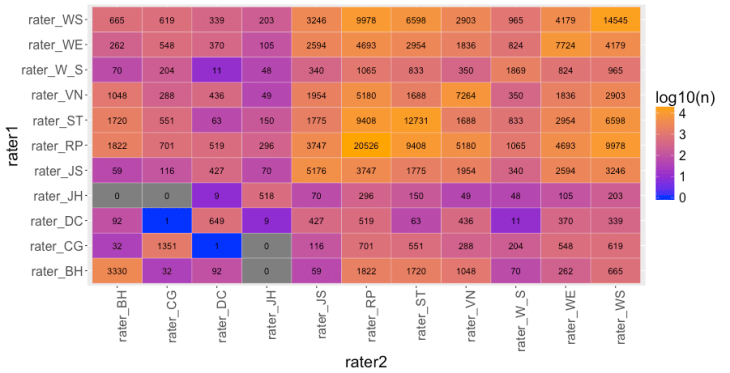 For instance, Wine Enthusiast (WE) and Stephen Tanzer (ST) co-rated 2954 different wines. Thus, this is a pretty respectable data set.
Exploratory data analysis: one starting point is to examine the correlation between each pair of raters: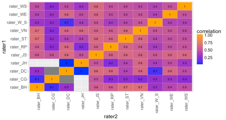 This highlights a couple of findings: i) there are a number of pairs of raters with very low correlations, such as Connoisseurs Guide (CG) and Burghound (BH), ii) there are no pairs of raters with correlations 0.8 or higher; they typically occur in the range 0.4–0.6.
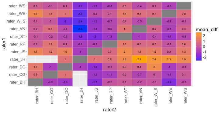
To get absolute difference, another informative metric is the mean difference of ratings (over the set of co-rated wines) between each pair of raters, taking rater 1’s score minus rater 2’s score. Thus, if rater 1 tends to rate each wine higher than rater 2, there will be a positive mean difference. If they rate them the same (or, potentially, if they are perfectly anti-correlated), there will be zero mean difference.
In the heat map below, brighter colors are higher mean differences (rater1 – rater2). One rater that stands out is James Halliday (rater_JH). If we go across his row, we see that each number is positive, going as high as 2.9 points compared to Vinous (VN). (Another way to see this result is to scan his column in which the mean differences are all negative.)
Stephen Tanzer (ST), Wine & Spirits (W_S), and Berghound (BH) tend to be tougher than the rest of the crowd as their row values are mostly negative. Robert Parker, and others, are a reasonable mix of positive and negative values.
 We can grasp this more clearly if we compute the proportion of the cells in each row that are positive (mean_prop_positive) and also the mean of mean differences by averaging each row; this captures how a rater’s typical wine rating compares to another rater, averaged over all other raters (mean_mean_diff).
| rater1 | mean_prop_positive | mean_mean_diff |
|---|---|---|
| rater_JH | 1.00 | 1.80 |
| rater_JS | 0.90 | 1.06 |
| rater_WE | 0.80 | 0.52 |
| rater_RP | 0.70 | 0.30 |
| rater_DC | 0.40 | -0.05 |
| rater_CG | 0.56 | -0.21 |
| rater_VN | 0.50 | -0.32 |
| rater_WS | 0.40 | -0.43 |
| rater_BH | 0.11 | -0.73 |
| rater_W_S | 0.20 | -0.73 |
| rater_ST | 0.00 | -0.94 |
Thus, this is one way to rank our raters: tougher raters are at the bottom, more generous raters at the top.
Additional Data Visualization: single metrics such as these don’t capture the true behavior of a pair of raters co-rating thousands of bottles of wine. One aid is to plot the joint rating distributions.
For instance, this is the joint distribution of the 9408 ratings for Robert Parker (rater r1, y-axis) and Stephen Tanzer (rater r2, x-axis):
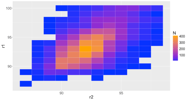 This distribution is positively correlated, roughly bivariate normal but skewed towards higher ratings, with a peak around 92 / 93 points and range of 87–100 points each. Importantly, note the breadth of this distribution: for some wines, Robert Parker gave 100 points while Stephen Tanzer gave just 88.
Plotting the joint distributions for all pairs of raters: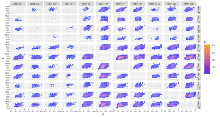 the high variability among raters is obvious. They are positively correlated but raters rarely agree and the distributions are fairly broad.
What’s one to do? If you care about and believe in ratings, then one strategy could be to stick with a single rater. Find a rater that you tend to agree with, or can at least calibrate against, and then stick to that single source. However, and this is the kicker, studies have shown that the same rater rating the same wine multiple times are not consistent. The ratings—same person, same wine—can vary ±4 points! Ratings might indeed be bullshit.
Cheers!
